Making "Sense" of Retail

Introduction
Successful retailers recognize the importance of delivering retail environments that enhance the experience for their customers. With so many options and channels available to shoppers today, a focus on optimizing the brick-and-mortar experience has become a greater priority for retailers and designers. Efforts to enhance that physical and personal shopping experience walk a fine line between trendy and traditional. Trendy store design that is not backed by in-store experience data can feel disconnected from shoppers’ desires and needs, while traditional retail design methodology is no longer sufficient to engage and energize shoppers. Today’s consumers may be inspired by in-store environments that appeal to their senses, which in most cases, haven’t been addressed by designers and retailers alike. Understanding how to incorporate the senses—sight, smell, sound, touch (and taste, when applicable)—into the design philosophy may provide retailers with a strategic, competitive advantage to create must-visit retail stores.
To learn more about the effects of in-store experiences on the senses and behaviors of specialty retail shoppers, BHDP initiated its fifth shopper study since 2020. This survey engaged 900 specialty apparel consumers nationwide in June 2022 and presented specific questions about four of the five human senses—sight, touch, sound, and smell—and the ways these senses either positively or negatively affect their in-store experiences.
Based on the responses collected from the survey, there is enough data to suggest that designing for a visual aesthetic alone may not be enough to create a positive and memorable in-store shopping experience. The results of the research shed new light on the significance of understanding human senses as they relate to the shopping process, and it offers retailers and retail designers insights into a possible new way of delivering the optimal in-store shopping experience.
In the future, BHDP looks to expand upon this first phase of sensorial research and accumulate concrete evidence of the positive and negative influences of sensory-based design.

Research Scope
General Set-Up
BHDP developed the research hypothesis, wrote the shopper questionnaire, and engaged an independent, online research firm to gather input from 900 apparel shoppers from across the United States. The methodology for this survey was inspired by BHDP’s approach to visioning sessions with clients. Like the goal of this survey, these visioning sessions elicit subconscious reactions from clients to inform design decisions.
Pre-Qualifications
To be eligible for the survey, respondents were required to have shopped in-store in the specialty brand category within a 30-day window prior to the survey launch. The 30-day window was to aid in shoppers’ recall of these visits. The retailers identified in the pre-qualifying survey question were American Eagle/Aerie/Offline, Athleta, Gap, H&M, J. Crew, Levi’s, Old Navy, Lululemon, and Madewell. These brands were selected because they share a similar target audience, ensuring respondents were part of that demographic. However, the selected brands did not factor into the questions in the main survey.
Respondents also were asked which store environment provided them with the most positive and negative experiences, and they had the option to elaborate on the experience in an open response field. While the initial questions identified certain specialty apparel brands to ensure respondents satisfied the eligibility criteria, the remainder of the survey questions were unrelated to a specific retail brand or store. Instead, the survey asked respondents about how their senses might influence their experience in a non-specified retail store environment.

The Survey
The survey presented each respondent four to five collages at random from a set of 26. Each collage contained pictorial representations of a human sense and respondents saw at least one collage from each of the four sense groups: sight, smell, sound, and touch. The approach was to present respondents with imagery that was not necessarily an in-store setting but a representation of certain senses and determine if they reacted positively or negatively.
After viewing a collage, respondents were asked to “Imagine a shopping environment, like the examples pictured …” and respond to the question, “How does this environment make you feel?” by selecting from the following 14 response options: calm, satisfied, excited, relaxed, overwhelmed, stimulated, energized, anxious, fulfilled, unimpressed, bored, drained, frustrated, and disappointed. Respondents could select one or more of the identified feelings for each collage and the order of these choices was randomized. Most respondents selected two to three choices for each collage. They were required to select from the 14 response options presented in the survey; “Other” or a space to write in an alternative to those 14 feelings was not an option. Each collage was shown randomly to an average of 138 shoppers.
Research Objectives
The goals of the research were to:
- To understand how sensorial experiences might affect shopper behaviors in-store.
- To introduce the positive and negatives of incorporating sensorial experiences into a store’s design aesthetic and environment.
- To define the opportunities to create optimal in-store experiences for shoppers
Collage Standouts by Category
SIGHT - Color
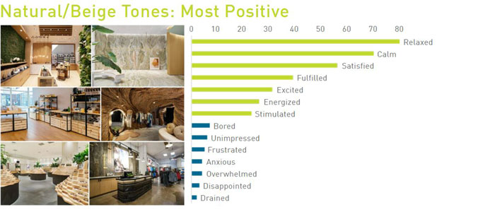
Natural/Beige tones received the most positive responses of the six collages in the Color category. Ninety percent of respondents reacted positively to this collage. The top seven reactions from respondents were all positive. “Relaxed” received the fourth-most reactions survey-wide out of all 26 collages.
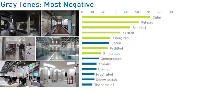
Gray tones received the most negative responses of the six collages in the Color category. Twenty-seven percent of respondents reacted negatively to this collage. “Bored” was the sixth-most commonly selected reaction, with 17 percent of respondents choosing the option.
SIGHT - Experiential Graphic Design
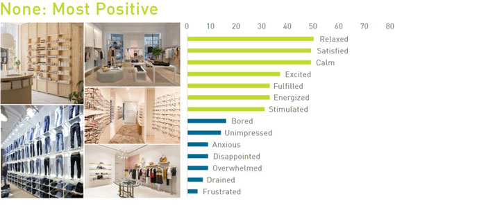
No EGD received the most positive responses of the four collages in the EGD category. Eighty-two percent of respondents reacted positively to this collage. The top seven reactions from respondents were all positive.
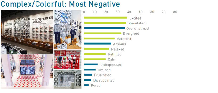
Complex/Colorful EGD received the most negative responses of the four collages in the EGD category. Twenty-two percent of respondents reacted negatively to this collage. “Overwhelmed” was the third-most commonly selected reaction, with 23 percent of respondents choosing the option.
SIGHT - Lighting
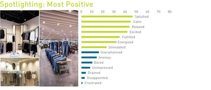
Spotlighting received the most positive responses of the three collages in the Lighting category. Eighty-three percent of respondents reacted positively to this collage. The top seven reactions from respondents were all positive.
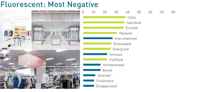
Fluorescent received the most negative responses of the three collages in the Lighting category. Thirty-four percent of respondents reacted negatively to this collage. “Overwhelmed” was the fifth-most commonly selected reaction, with 20 percent of respondents choosing the option.
SMELL - Aromas
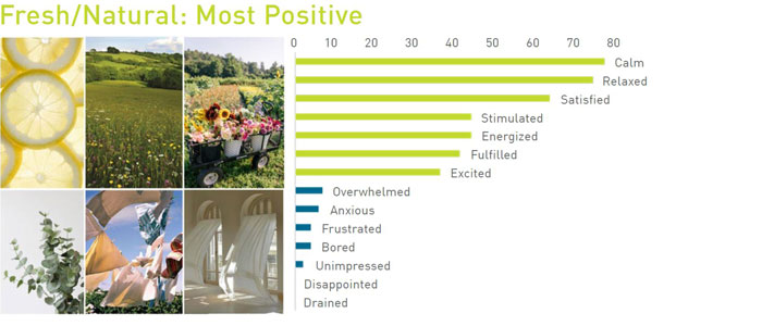
Fresh/Natural received the most positive responses of the four collages in the Aromas category. Ninety-four percent of respondents reacted positively to this collage. The top seven reactions from respondents were all positive. “Calm” received the fifth-most reactions survey-wide out of all 26 collages.
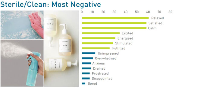
Sterile/Clean received the most negative responses of the four collages in the Aromas category. Sixteen percent of respondents reacted negatively to this collage. Despite this receiving the most negative reactions in the category, the top seven answer choices remained positive.
SOUND - Styles
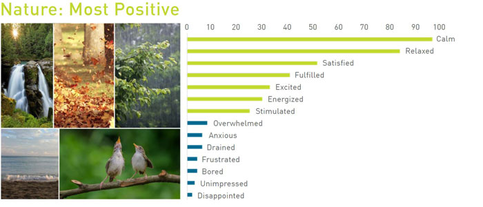
Nature sounds received the most positive responses of the six collages in the Style category. Ninety-two percent of respondents reacted positively to this collage. The top seven reactions from respondents were all positive. “Calm” received the most reactions survey-wide out of all 26 collages.
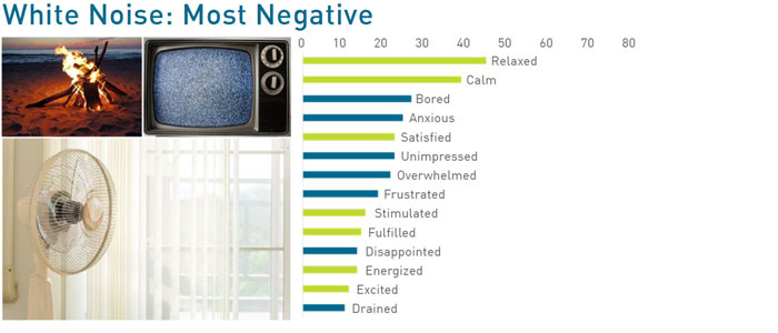
White Noise received the most negative responses of the six collages in the Style category. Forty-eight percent of respondents reacted negatively to this collage. “Bored” was the third-most commonly selected reaction, with 19 percent of respondents choosing the option.
TOUCH - Materials
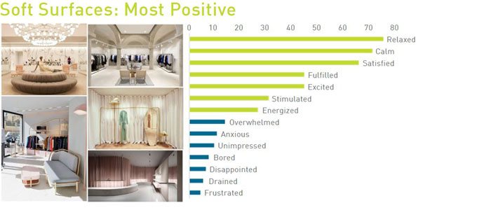
Soft Surfaces received the most positive responses of the three collages in the Materials category. Eighty-six percent of respondents reacted positively to this collage. The top seven reactions from respondents were all positive. “Relaxed” received the seventh-most reactions survey-wide out of all 26 collages.
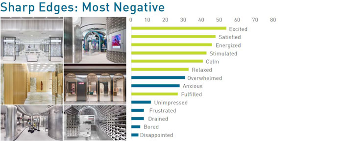
Sharp Edges received the most negative responses of the three collages in the EGD category. Twenty-four percent of respondents reacted negatively to this collage. “Overwhelmed” was the seventh-most commonly selected reaction, with 22 percent of respondents choosing the option.
Research Findings
Scoring
The BHDP team examined the respondent data to identify which collages elicited positive feelings (calm, satisfied, excited, relaxed, fulfilled, stimulated, or energized) and which elicited negative feelings (anxious, overwhelmed, unimpressed, bored, drained, frustrated, or disappointed). These categories were used to determine overall positive and negative ratings of each collage.
For each collage, a score was determined based on a combination of: total respondent reactions, the proportion of positive to negative selections, and the frequency of positive answer choices. This allowed collages to be compared and ranked based on quantity and averages. For instance, the sense of SMELL – Fresh/Natural Aromas collage received a high positive score because it had the most reactions survey-wide (412 reactions from 138 respondents), had a high percentage of positive reactions (94% positive), and a high selection of positive answer choices (For instance, 79 of 138 respondents chose calm).
The collages receiving the highest individual positive response scores were:
- SOUND – Nature: 71 percent of respondents said they felt calm.
- SMELL – Neutral/Natural Aromas: 67 percent of respondents said they felt calm.
- SOUND – Gentle/Acoustic Music: 67 percent of respondents said they felt calm.
- SIGHT – Natural/Beige Tones: 58 percent of respondents said they felt relaxed.
- SMELL – Fresh/Natural Aromas: 57 percent of respondents said they felt calm.
Overall, negative responses accounted for smaller percentages of total responses than positives for most collages. However, there were spikes of certain answer choices that were well above the typical average.
The collages receiving the highest individual negative response scores were:
- SIGHT – Complex/Monotone EGD: 26 percent of respondents said they felt overwhelmed.
- SIGHT – Complex/Colorful EGD: 23 percent of respondents said they felt overwhelmed.
- SOUND – Loud/Heavy Metal Music: 23 percent of respondents said they felt overwhelmed.
- TOUCH – Sharp Edges: 22 percent of respondents said they felt overwhelmed.
- SIGHT – Bright Colors: 20 percent of respondents said they felt overwhelmed.
In terms of positive sensorial experiences, three out of the four senses in this study ranked in the top five of most positive reactions. The perceived senses of: sound of nature ranked first (sound), neutral scents ranked second (smell), gentle/acoustic sounds ranked third (sound), the physical sense and expression of natural/beige tones in an environment ranked fourth (sight), and the perceived sense of fresh scents ranked fifth (smell). The sense of touch did not rank in the top five for positive sensorial experiences. Shoppers selected calm and relaxed as the top positive feelings.
For negative sensorial experiences, three collages affecting the sense of sight ranked first, second, and fifth (Complex/Monotone graphics, Complex/Colorful graphics, and Bright Colors palette, respectively). The Loud/Heavy Metal collage (perceived sense of sound) ranked third and the Share Edges collage (sense of touch) ranked fourth. The sense of smell did not rank in the top five for negative sensorial experiences. Overwhelmed was the most commonly selected negative feeling expressed by shoppers.

Analysis of Findings and Research
The results from this research suggest the possibility of a subconscious effect on shoppers when their senses are stimulated in the physical retail environment. For example, respondents chose a contextually low amount of positive feelings in response to the fluorescent lighting image and prompt. Fluorescent lighting received a significant negative reaction and, notably, 20 percent of respondents selected overwhelmed, compared to the average selection of overwhelmed at 11.2 percent per collage. This suggests that fluorescent lighting can negatively impact a shopper’s in-store experience. Respondents preferred natural/beige tones and pastels, both of which had respondents selecting mostly positive responses. However, they reacted negatively to monochromatic and detailed wall graphics (Complex/Monotone EGD) which received the highest percentage of negative responses out of all collages. Respondents favored the perceived sound of Nature and Gentle/Acoustic music over both White Noise and Loud/Heavy Metal music while shopping. All four collages representing the sense of smell received high percentages of positive responses and low percentages of negative responses. Respondents answered more favorably for soft or hard surfaces, with sharp edges receiving a higher number of overall negative responses.
Positive Reactions
Collages were ranked by assimilating all the reactions from respondents. The top two collages were from the sense of smell category. The collage representing Fresh/Natural Aromas elicited 94 percent positive responses and the collage representing Rich/Enhanced Scents elicited 93 percent combined positive responses. When respondents were asked why their experience during a recent store visit was positive at the beginning of the survey, one said, “The store smelled clean.” For both collages, most age groups and both genders chose calm and relaxed as the top responses.
Ninety-two percent of the reactions to the SOUND-Nature collage were positive, with, once again, relaxed and calm as the top two responses. More than 60 percent of 35-44-year-olds and both genders, as well as more than 53 percent of 25-34-year-olds, selected both relaxed and calm responses. Positive selections accounted for 90 percent of responses to the SIGHT-Natural/Beige Tones collage, followed by the SIGHT-Pastels and SOUND-Gentle/Acoustic Music collage which each received 89 percent positive responses.
Eighty-four percent of respondents selected positive reactions after viewing the SMELL-Neutral/Natural Aromas collage. The 45-54 year-old group especially favored to this sensorial experience as 70 percent selected relaxed and 85 percent selected calm. More than 52 percent of respondents selected relaxed and more than 64 percent selected calm for how the collage made them feel. The TOUCH-Hard Surfaces collage received 82 percent positive responses with more males than females selecting relaxed, satisfied, calm, excited, or energized. Similarly, more males than females indicated the SIGHT-Simple EGD collage (80 percent combined positive responses) made them feel excited or energized.
Other collages also ranking in the 80-90 percent combined positive responses included:
- TOUCH-Soft Surfaces,
- SMELL-Sterile/Clean Aromas
- SIGHT: Spotlighting, No EGD, Warm/Ornate Lighting, and Dark Colors.
Negative Reactions
The collage representing SOUND-White Noise elicited the most negative responses with 145 reactions, or 48 percent of the total answers selected. Men and women had significantly different feelings about this collage as more males selected disappointed (17.3 percent compared to 4.5 percent) while more females selected overwhelmed (18.4 percent compared to 9.6 percent).
Thirty-four percent of respondents selected negative responses to the SOUND-Loud/Heavy Metal Music collage. When segmented by age, an average of 23 percent of respondents selected overwhelmed, with the percentage increasing as the respondents age increased. Conversely, while an average of 36 percent of respondents selected energized, the percentage decreased as age increased. Unsurprisingly, less than 20 percent from all age groups selected relaxed for how this environment made them feel. Respondent reactions to this collage were consistent with a response to the specialty store environments in the pre-qualification section with a respondent stating,“[the store is] too loud and I feel overwhelmed.”
Thirty-four percent of respondents also selected negative responses to the SIGHT-Complex/Monotone EGD collage. More than 30 percent of 45-54 year-olds said they felt both anxious and overwhelmed by this collage and 42 percent of the 55-64+ group felt overwhelmed by the collage. While only 7.5 percent of females felt fulfilled, 22 percent of males selected that response.
Negative reactions to the SIGHT-White Colors collage were selected by 23 percent of respondents, yet more than 40 percent of both males and females said they felt calm when looking at this collage. The SIGHT-Complex/Colorful EGD collage elicited 22 percent negative reactions with 33.3 percent of all age groups (average) feeling overwhelmed.
Other collages also ranking in the 20-48 percent combined negative responses included TOUCH-Sharp Edges, two collages for SOUND: Classical/Instrumental Music and Pop/Heavy Beats, and three collages representing SIGHT: Fluorescent Lighting, Gray Tones, and Bright Colors.
In summary, the shoppers surveyed preferred “softer” environments that made them feel calm and relaxed. In the pre-qualification section of the survey, many respondents used the words calm and relaxed in their open response describing recent positive experiences at specialty brand stores. One Old Navy shopper said the store “just has a really fun and relaxed atmosphere.” A Levi’s shopper said, “the nice calm setting and chill music,” contributed to a positive in-store experience. On the other hand, respondents used statements like “the environment was intense,” “the store is dark, disorganized,” and “the environment wasn’t welcoming at all” to describe their negative experience in a specialty store.
Respondents reacted positively to spotlighting as opposed to fluorescent and warm lighting. “It is bright and cheery,” said one Old Navy shopper while another stated, “There is lots of natural light.” They gravitated toward environments with natural, beige, or pastel colors instead of bright colors or experiential graphics. Respondents also indicated a preference for nature sounds or gentle/acoustic music, rather than loud or heavy metal music or white noise. They desired neutral or fresh smells more than rich or enhanced smells and soft or hard surfaces rather than sharp edges. One Athleta shopper summed it up by saying, “The store is aesthetically pleasing.”
Recommendations
Overall, the respondents are saying they are “satisfied” with their store visits, but retailers must do more than just satisfy their customers. They must aim to balance a mixture of emotions and feelings—including energized, stimulated, excited, calm, and relaxed—among their shoppers. Additionally, retailers need to reduce negative emotions customers might feel while shopping, such as drained, unimpressed, overwhelmed, disappointed, frustrated, and anxious. Achieving this balance is tricky; designing spaces so shoppers feel energized and stimulated also may make them feel drained and overwhelmed. Similarly, shoppers may be unimpressed when retailers are trying to evoke feelings of calmness. Being intentional and purposeful with their design choices will help retailers walk this fine line. The research suggests designers should consider all of the shoppers’ senses while also aligning to the brand’s core customers.
In a prior survey, BHDP asked shoppers about their behaviors when shopping in-store. These respondents indicated that seeing and touching the merchandise was a significant factor for visiting a retail environment (versus shopping online). Shoppers want to examine the product, touch it, feel it, and try it on. While the sense of touch is important for the products, it is not as important when it comes to store design. In this survey, none of the sense of touch collages appeared in the top five of the most positive sensorial experiences. People reacted strongest to images and perceived feelings related to the three senses besides touch. Also, surprising was the result that shoppers gravitated toward collages representing the perceived sense of smell and sound. In this survey, these senses were more influential to shoppers than the overall aesthetic of the physical retail environment, even though retail spaces typically are not designed around the idea of sound or smell. This does not mean retailers should create environments where they pump fresh air or lemon scents into the space or add the sounds of birds chirping or waves breaking as their background music. Instead, the key to heightening these senses could be to aesthetically create the perception and bring these senses to life with cues built into an intentional design that makes sense for the brand and store.
Feeling calm and relaxed were the primary emotions selected by respondents regardless of age or gender. By taking the time to understand shoppers, designers and retailers can create environments allowing consumers to better connect with brands through sensory cues. Just as important, designing retail environments that allow shoppers to feel relaxed or calm consistently enhances their in-store experience, strengthens their relationship to the brand, potentially increasing the likelihood of repeat visits and bigger baskets.
Applying Sensorial Design to Create a Competitive Advantage
The results of the survey demonstrate there are potentially environmental sensorial elements within a retail space that heighten the human senses to provide a positive experience. Conversely, there could be environmental sensorial elements that negatively impact the human senses and provide a less positive and even negative experience. If shoppers’ senses are negatively impacted, they may leave the store before completing a purchase and, in a worst-case scenario, never return. Incorporating specific design elements to stimulate senses might elicit the positive feelings shoppers seek while in-store shopping, keep them in the store longer and increase the number of items they purchase, and encourage them to become a loyal customer.
Retailers may benefit from understanding how to bring all of a shoppers’ senses to life in their stores, not just sight and touch. It is not about following the latest trends in retail design or relying on the latest technology to “wow” shoppers. Rather, it may be more important to incorporate the right elements in the retail environment that are preferred by the brand’s target shopper. When describing the positive experiences shoppers had recently in the pre-qualification section of the survey, many used words such as “upbeat, pleasant, cozy, exciting, uplifting, great energy, and innovative,” in addition to calming and relaxed.
Knowing the positive and negative effects the senses may have on a shopper’s experience could assist in designing relevant experiences that appeal to and heighten shoppers’ senses. Shoppers who are immersed in the retail environment through their senses and are excited, energized, stimulated, relaxed, calm, satisfied, or fulfilled while shopping will feel better about their retail experience. Research has demonstrated that if shoppers’ senses are heightened while in the retail environment, they are more likely to stay in store longer than if they were experiencing negative sensorial feelings1. By remaining in store longer, they will likely spend more time browsing with the potential to add more to their cart and leave the store excited for their next visit. In the future, we may see retailers who get it right engage shoppers in an interconnected brand experience designed to stimulate shoppers’ senses. Implementing sensorial retail design tactics that cohesively target shoppers’ senses might offer retailers a powerful strategy to provide shoppers with positive and memorable retail experiences, resulting in satisfied and loyal customers.
You can read Part I, Part II, and Part III of this white paper on VMSD's website.
Author
Content Type
White Paper
Date
January 13, 2023
Market
Topic
Design Thinking
1 Comment


Declan McCormack, Client Leader
Declan McCormack has more than 25 years of retail expertise including branding, strategy, design, and implementation. Starting his career in London, he has managed projects internationally and worked with global brands. He is passionate about all things retail and serves as primary client contact and team leader for BHDP’s Retail and Retail Banking groups.