
SEGD Experience: Austin
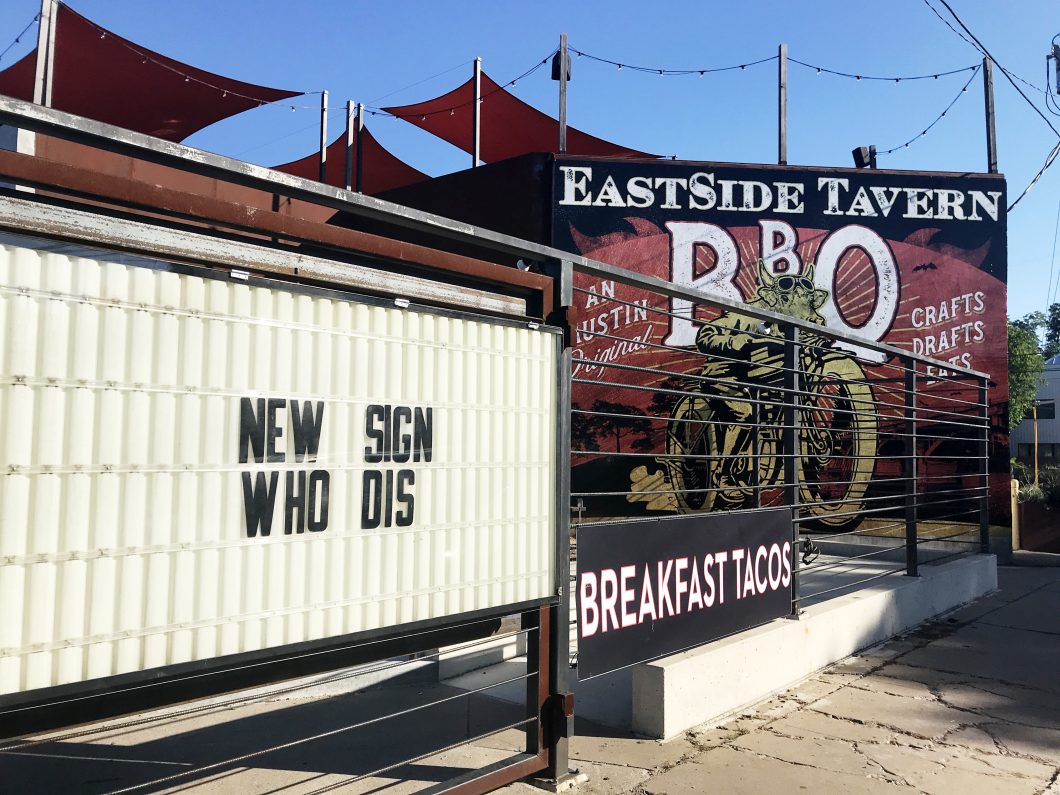
The most quintessentially SEGD Austin collection of signage features a new sign, tacos, and BBQ. (E. César Chávez Street)
On the last morning of the SEGD Conference, I wandered from downtown Austin under the I-35 overpass down East César Chávez Street in search of coffee. The morning greeted me with the incessant chatter of flamboyant great-tailed grackles and the deep hum of construction equipment. After thirty minutes, already feeling the heat of the Texas summer sun, I arrived at my destination and prepared for the day with a cappuccino, a plate of buttered toast, and some over easy eggs.
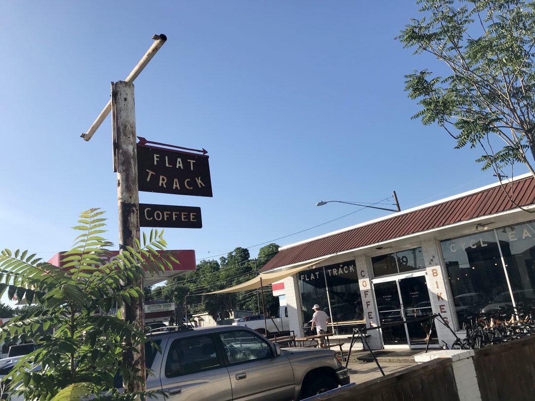
Flat Track Coffee repurposes an existing sign post and complements the patina with Corten signage. (E. César Chávez Street)
My walk back to the conference was not particularly eventful. It was a sleepy Saturday morning, and most of the people in the city had yet to start their day. However, as I took a second turn down César Chávez Street towards downtown, the street began to reveal to me what the many speakers at the conference were attempting to articulate as they described their beloved city.
I had heard Austin described as having a bit of “funk,” a little “scrappy,” and “rough around the edges,” but found it difficult to comprehend exactly what they were describing. It was my first time visiting the great state of Texas, and I had spent most of my time amongst the glossy, new high rises in Austin’s central business district. From slides and discussion panels, I had learned that Austin was a small town reconciling with its newfound identity as a major city. There was a great pride in the city coupled with a sense of urgency — something that was core to the identity of the city’s inhabitants was at risk of being disrupted by over-planning and over-design.
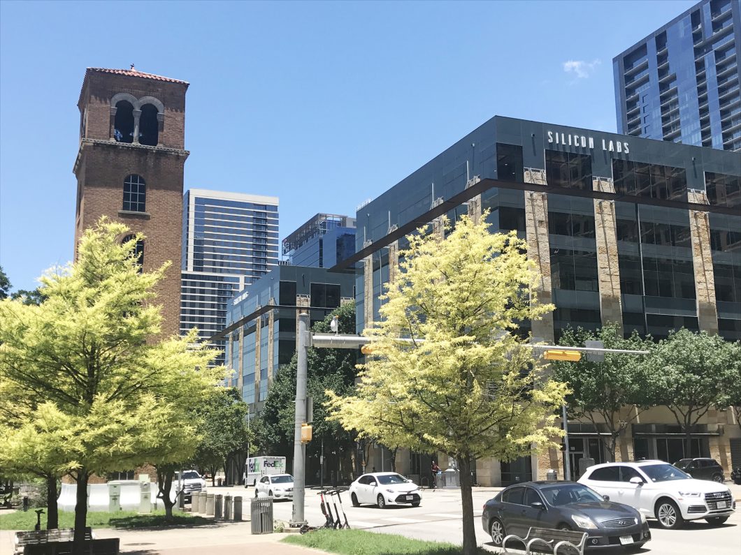
History and modernity sit side-by-side along West César Chávez Street in downtown Austin. (W. César Chávez Street)
Amidst the first ring suburbs, Austin’s spirit manifested itself through the hand lettering and neon signs of small businesses. Via a little bit of rust and some weathering from the sun, the grit which Austin’s design community had so fondly described began to speak to me of the city’s true character. While not all of the street’s businesses and signage were of the past, the signage collectively emulated the visual language that has come to define the city, capturing through materiality an Austin informality, honesty, and sense of humor.
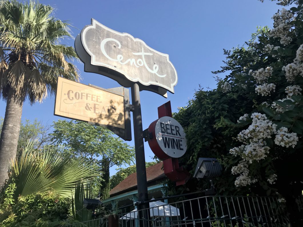
Hand painted and vintage signage create a collage of the offerings at Cenote café. (E. César Chávez Street)
In true Texas fashion, much of Austin is adorned with large graphics that call out boldly for your attention. This is especially apparent downtown, where the scale of the signage fluctuates dramatically in size alongside the city’s evolving skyline. Spurred by economic development and an influx of an average of 120 new residents each day, the design community is adapting to the new demand for space within the city.
Public spaces have become crucial for equity not only among Austin’s residents but also between increased urbanity and Austin’s natural habitats. Refuges for people and wildlife alike are designed into a vast network of parks that create corridors from urban spaces toward the Colorado River and community spaces like the downtown public library.
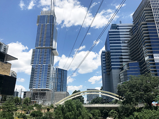
Austin’s greenways emerge from the city’s newly constructed high-rise landscape. (Shoal Creek)
Upon my visit to the Austin Central Public Library, I found myself developing some serious library envy. The building is a visible, physical statement by the local municipality that communicates a desire to put the public first. I meandered from a mixed-use district across the Shoal Creek Trail and through the library’s gardens, where a macro bike icon identified a parking amenity to the approaching school children. When I entered, I was drawn up the grand staircase by the filtered, natural light pouring in through the façade and laughter from the children’s library, and to my surprise, I hadn’t even considered taking the elevator to ascend to the rooftop gardens on the 6th floor.
As I wandered the space, I discovered the signage system within the building focused on the users’ need to gather and seek the discovery of knowledge together. The overhead signage made finding amenities like “information” and “self check-out” a simple task from across a room. Large-scale floor plans next to the elevators made it easy to navigate the library’s main sections and multiple floors. Additionally, the subject matter titles were placed at eye level atop the bookshelves so they would be plainly visible as one entered a section.
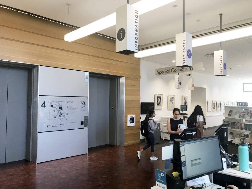
Informative signage makes the library easy to navigate and accessible. Universal icons are used to communicate to all language speakers. (Austin Central Public Library)
The experiential graphics were not only informative, but they also created playful moments throughout the space. The infographic that detailed the history of the local electric infrastructure was cleverly placed on a window that overlooked the utilitarian structure outside. Sturdy letterforms were accessible for children to climb upon, inviting them to directly interact with the word “CHILDREN.”
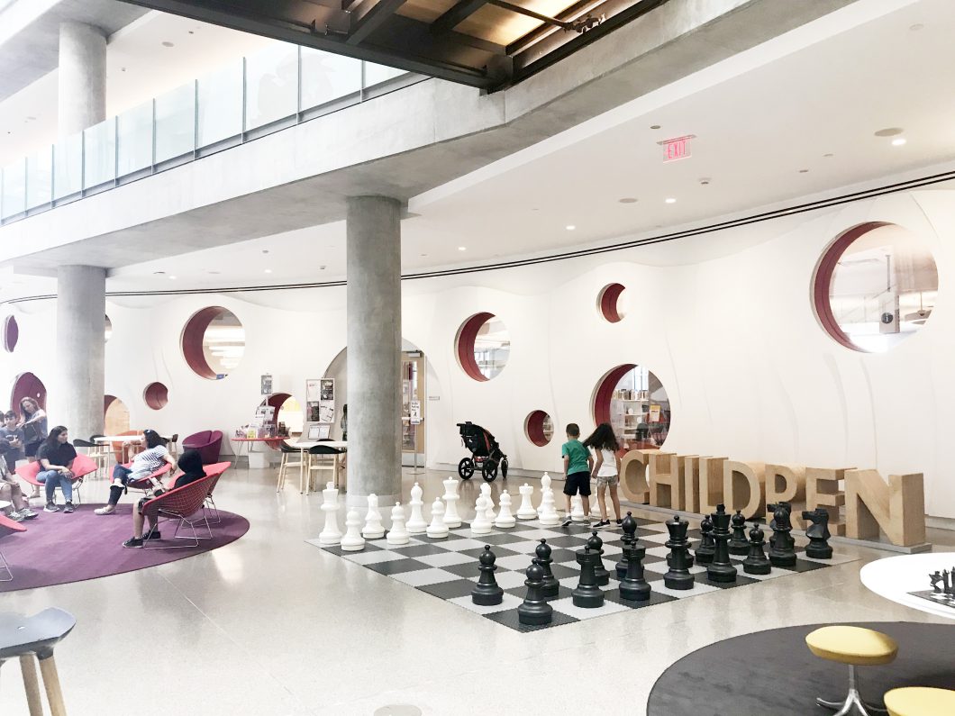
The Austin Central Public Library was filled with life and energy. From a business group utilizing the reservable rooms as a secondary office space to youth organizing their regular Magic the Gathering meet up, it was clear to me that the library was a space designed with the user experience in mind — a space for all people to feel welcome and enjoy.
After exploring Austin for the three days of the 2019 SEGD Conference, it is apparent to me from first-hand experience that Austin’s passionate design community is not afraid to be bold, is proud of their Austin “funk,” and aspires to put the needs of their neighbors first.

Lisa Bambach, Experiential Graphic Designer
As a skilled Experiential Graphic Designer, Lisa has several years of experience creating branded environments for a variety of clients including P&G, Quantum Health, Ensemble Health, and 84.51°. Lisa utilizes her creativity as a designer to enhance employee and visitor interaction with physical space by integrating narratives into the environment. She also acts as an educator for younger designers through the University of Cincinnati.
No comments